Showing posts with label lace. Show all posts

Monday, 2 May 2016

Packaging - The Finished Product


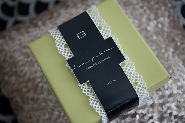
This is the first set of packaging for the 'Floral' scent. Whilst designing the packaging, I wanted to create something that reflected the scent name through the pattern design, but still keep it neutral toned. The abstract take on a floral print still portrays an element of trust and nature- qualities that are also part of our brand value, but also appeal to our young target market of being fun yet sophisticated. 

The second set of packaging is for our other scent, 'Fresh'. As the name suggests, it is zingy and clean. To portray the connotations of fresh, I decided that more vibrant colours needed to be used. Originally, the band around the middle was meant to be mustard yellow, however when printed it became more of a citrus lime- which happened to still work well. The geometric print again appeals to our target consumer as it is modern and trendy. 

All of the packaging was designed and hand made by myself. 


Friday, 29 April 2016

Packaging Development - The Making

This is the part of this module so far which I have found the most fun to do - developing and making the packaging. At first, we were only going to do a digital model, however, I am not the best at making things looks realistic when on the computer, instead it just looks very cartoon like. So to saves the frustration and hating the work I produced, I decided to physically make the packaging so that we could use it in the studio and take photos-

Here, is my original attempt of packaging which I created on Photoshop:


Following on from this, I went out and brought two boxes and some patterned card and paper to make the boxes. I started by tracing the net of the box and using super glue to stick it down in place, like so-


Leaving the finished covered boxes looking like this:


It was obvious that the brand logo, product name etc. needed to be on the packaging. At first, I wanted to use gold alphabet stickers to create the name, however, the only ones I found were either too big or the wrong font. Which meant that this idea was not going to work.

After researching some more on Pinterest, I came across two ideas. Either creating a sticker to go on the top, or a band to go around the box:

As a group we opted for the band around the box. The next decision was to decide whether to have it one shape, or have a box almost coming out where our product name and information would be:

Here are some examples of the development of the bands on the computer...


After getting them printed, I then added the lace around the edges of the band, resulting in the final packaging looking like this:


My next blog post will be the more professional and high quality photos that I took of the packaging, showing it in more detail, so keep your eyes out...

Wednesday, 27 April 2016

Creating A Brand Aesthetic - Colour Palette and Packaging


 Choosing your brand aesthetic can be difficult. At first we wanted nudes, but then we settled on more brighter colours that allowed us to be more playful and really show our brand identity to it's audience. There has been several different prints and patterns that I have found which I thought would be useful, but when putting them onto our desired packaging it just did not translate. Here are a few examples of prints that I originally liked.


When looking into packaging for inspiration, I came across this image where a block colour and print were merged together. This was the main inspiration behind our packaging leading to the patterns, textures and colours below.


(The use of pattern, block colour with an added texture of the lace)

I have found putting together our brand aesthetic and colours really fun to do, the next blog post will be about the development and making of the packaging.