Monday 2 May 2016

Packaging - The Finished Product


This is the first set of packaging for the 'Floral' scent. Whilst designing the packaging, I wanted to create something that reflected the scent name through the pattern design, but still keep it neutral toned. The abstract take on a floral print still portrays an element of trust and nature- qualities that are also part of our brand value, but also appeal to our young target market of being fun yet sophisticated. 

The second set of packaging is for our other scent, 'Fresh'. As the name suggests, it is zingy and clean. To portray the connotations of fresh, I decided that more vibrant colours needed to be used. Originally, the band around the middle was meant to be mustard yellow, however when printed it became more of a citrus lime- which happened to still work well. The geometric print again appeals to our target consumer as it is modern and trendy. 

All of the packaging was designed and hand made by myself. 


Friday 29 April 2016

Packaging Development - The Making

This is the part of this module so far which I have found the most fun to do - developing and making the packaging. At first, we were only going to do a digital model, however, I am not the best at making things looks realistic when on the computer, instead it just looks very cartoon like. So to saves the frustration and hating the work I produced, I decided to physically make the packaging so that we could use it in the studio and take photos-

Here, is my original attempt of packaging which I created on Photoshop:


Following on from this, I went out and brought two boxes and some patterned card and paper to make the boxes. I started by tracing the net of the box and using super glue to stick it down in place, like so-


Leaving the finished covered boxes looking like this:


It was obvious that the brand logo, product name etc. needed to be on the packaging. At first, I wanted to use gold alphabet stickers to create the name, however, the only ones I found were either too big or the wrong font. Which meant that this idea was not going to work.

After researching some more on Pinterest, I came across two ideas. Either creating a sticker to go on the top, or a band to go around the box:

As a group we opted for the band around the box. The next decision was to decide whether to have it one shape, or have a box almost coming out where our product name and information would be:

Here are some examples of the development of the bands on the computer...


After getting them printed, I then added the lace around the edges of the band, resulting in the final packaging looking like this:


My next blog post will be the more professional and high quality photos that I took of the packaging, showing it in more detail, so keep your eyes out...

Wednesday 27 April 2016

Creating A Brand Aesthetic - Colour Palette and Packaging


 Choosing your brand aesthetic can be difficult. At first we wanted nudes, but then we settled on more brighter colours that allowed us to be more playful and really show our brand identity to it's audience. There has been several different prints and patterns that I have found which I thought would be useful, but when putting them onto our desired packaging it just did not translate. Here are a few examples of prints that I originally liked.


When looking into packaging for inspiration, I came across this image where a block colour and print were merged together. This was the main inspiration behind our packaging leading to the patterns, textures and colours below.


(The use of pattern, block colour with an added texture of the lace)

I have found putting together our brand aesthetic and colours really fun to do, the next blog post will be about the development and making of the packaging.

Monday 25 April 2016

Developing A Brand Logo - Evolve


As part of this module, we have to create both a brand name and logo. Our idea is to recreate the wardrobe diffuser, and turn it into something modern that has a connotation of anything other than lavender and your Gran!

We felt our concept was something new, hence the brand name: Evolve. This stands for something new and refreshing.


I then began to look into what we wanted our logo to signify. It was clear that we needed something that related to the wardrobe and feeling confident. Whether that was through shoes, a staple t-shirt or something simple like a hanger. An indefinite staple that you need in your wardrobe no matter what.

Developing on from this, we tried to combine the hanger with our brand name, and see how it worked in and against other colours...

Whilst studying this logo, we felt that it was almost a bit too 'spiritual' for our brand message. We felt it looked a bit too flowy and unsure almost, instead of the confident symbol we wanted to show.

So this brought us back to the one of the original ideas. Placing the first and last letters together; E and E to create a box almost. As shown on the right hand page in this image:


Resulting in our final logo being-


Although it is very simple, we feel that it is effective as our logo is not the main branding of our product, as we will be collaborating with people and brands: therefore the packaging needs to be relevant to the client, and not ourselves.

Wednesday 20 April 2016

Bronzed Eyes (Feat. Nars Duo in Isolde)

It's always this time of year that I begin to change my everyday make-up routine. Whilst summer is just around the corner, now is the time I begin to look for something much more golden and bronzy to incorporate into my makeup. I have been testing out lots of new eyeshadow shades, and these ones are the best I have tried to this create this simple everyday look.


This image is the overall look (that looks a lot more dramatic than when on the eye!) which I have tested it out on my hand so you can get a clear idea of what the eye look looks like and how the colours have been blended together.


Products used: Mac Mineralize Skin Finish in Dark Tan, Nars Duo in Isolde, Kiko Single Eyeshadow in Infinity, Mac Eyeshadow in Charcoal Brown, Blackout from the Urban Decay Naked 2 Palette, Rimmel Smoke 'N' Shine pencil in Copper Bling and Benefit They're Real Eyeliner in Black.

To start the look, take your bronzer of choice - I used the Mac Mineralize Skinfinish in Dark Tan - onto the crease, and blend to create a transitional shade.

Following this, taking the lighter shade out of the Nars Duo, pat this with your finger all over the lid, focusing on the inner half and centre of the lid. Then, using the darker shade, place on the outer half of the eyelid.

Using a warmer toned eyeshadow, take a smaller blending brush and blend into the crease, not bringing it too high. The bronzer still needs to be visible. In the very edge of the outer eyelid, blend a dark matte brown to create definition.

Line the upper lash line with a coppery brown pencil eyeline, and slightly bring down to the lower lash-line to create a smokey affect. On the middle to outer part of the lash line, place a black eyeliner to create a stronger definition. To set the liquid liner, using an angled eyeliner brush and take a matte black shade to go over the line you have just created.

Add any highlight of your choice to the inner corners and brow bone, add some mascara and the look is complete.

Here is the finished look on the eye:


Wednesday 24 February 2016

PERFUME STORIES

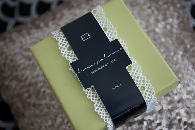
As with fashion, perfume also have trends within advertisements that tell a story. As with smell, the packaging and the brand all being important aspects of the promotion of a perfume, the advertisement is also crucial. Its purpose is to tell a story, a story that entices the consumer and draws them in to want to find out more. With hundreds of new fragrance launches and campaigns every year, the advertisements always seem to fall under one of these four categories: Seduction and Indulgence, Trust and Honesty, Kitsch and Humour or Tradition and Heritage.


SEDUCTION AND INDULGENCE


                                                                                                                         As you can see in the perfume advertisements, the main central theme running throughout is the use of women being sexualised, looking seductive or being seduced by men. This entices the consumer as it creates an element of excitement, leaving the consumer wanting to find out more. The main colour themes used in the advertisements are reds and purples, all dark colours to create a moody and mysterious atmosphere that have connotations of danger and fire.


TRUST AND HONESTY


Contrasting to the provocative nature of the seductive fragrance narrative, comes a purer and more natural story- Trust and Honesty. This story uses nature and cleanliness alongside the elements of air, water, earth and fire to create trust between the product and the consumer. The fresh blue, authentic green and natural white colour theme allows for a breath of fresh air, in which you feel that the products are essential and pure. This story is relevant for those who live an authentic and clean lifestyle.


KITSCH AND HUMOUR


Contrasting again to any other story, this story is much more playful and theatrical. It takes already written fairytales and turns them into something new and relevant for a perfume. It uses past references and movements within art such as pop-art to create unexpected and bright advertisements. The use of surreal pieces is witty and for those with a lively, and a bit more of a brighter style.

Whilst researching into this narrative advertisement, I couldn't help but notice the amount of celebrity perfumes using this story. What does this say? The kitsch taste reflects the target consumer of celebrity perfumes? If so, is it more of a story for a younger target audience, that doesn't appeal to a more mature audience? I feel that this would be the case, as all of the models used and celebrities are only people under the age of 21 would recognize, making them the target consumer not only for their perfume, but this narrative also.


TRADITION AND HERITAGE


This story is for the romantics. It is one that is full of love, nostalgia, and class with an element of vintage thrown in. It uses relationships to show love, whether that is intimately between two people or openly between family members. It allows the consumer to see a family, friendship or relationship in a charming location such as a garden or classic heritage building. As you can see from the images of the perfume adverts, laughter and love is shown throughout with cultural and heritage references throughout.


With perfume adverts being shown to us everyday not only in magazines, but on TV, in shops, on advertisements outside...- we can never escape the stories and narratives thrown at us, all with a purpose to entice and leaving you wanting to find out more.


Wednesday 3 February 2016

SOMETHING OLD, SOMETHING NEW

"Fragrance that used to whisper, now have to shout..."

Whilst watching the first part of a perfume documentary series, it got me thinking on how popular are perfumes nowadays? The documentary stated how brands now have to try and convince the younger generation that it is a 'liquid luxury', and should be an object of desire.

For me personally, I have scents that I like, but I would only ever get them as gifts- not something I would want to spend a lot of my own money on. That is also the case for a majority of people, as discussed in seminar sessions there is a common theme of perfume being something that you would never purchase yourself, instead something you would receive as a gift. But why is it not something you'd desire as much as say an item of clothing?

As mentioned in the program, around 20 years ago, there would be around 150 perfume launches a year. In 2011, that number increased to over 1200. So with the vast variety and range produced, it is clear to see how people are overwhelmed. So overwhelmed, in fact, the consumer no longer wants to be involved with perfume on a personal level?

With the marketing of the product now being as, if not more important as the scent itself- it shows how what was once seen to be a signature and distinctive item, has now been turned into a weapon for competition to try and be the best and gain a new customer. But once you have got that sale, how many of those customers stay loyal to that particular scent now? Before, you used to find a scent you liked and stick with it. Now, perfume is deemed to be a fashion accessory that you should switch up regularly. 

I feel it is almost evident that people rarely buy their own perfumes, through the fact the biggest perfume sales are on Christmas Eve, alongside the time leading up to Mother's Day. As it is clearly a 'last minute' cop out gift for partners and family members. Perfumes are something you buy someone as a safe gift, when you don't know what else to buy.

This problem will never go if the marketing and re-producing continues. Brands like to reinvent and remind their consumer of their perfumes. An example is by Calvin Klein, originally creating CK One, but then producing CK Two, to then go on to launch CKin2U. It is like an never-ending cycle.

As a conclusion note, when was the last time you brought your own perfume? Or went out looking for a new perfume? What do you think is leading the fragrance market to be so competitive?


Watch the documentary series here: https://www.youtube.com/watch?v=annRzLYrRwM

Wednesday 27 January 2016

CURRENT READS


I have never been a dedicated reader of Garance Dore's blog beforehand, therefore I kind of went into this a bit blind and not knowing what to expect. I picked this book up from one of the book shops in Chelsea Market, whilst in New York and I'm glad I did, it's not only very pretty but also very insightful!

Being a photographer and illustrator as well as running a blog and now an author- it was clear to see that this would be an interesting read. As like many successful people, they don't always have it easy; which is also true for Garance. She talks about her childhood, life, love and struggles before she got to where she is now.

Unlike many bloggers, you really get an insight into Garance's life on both a visual and personal level which allows the reader to connect more personally.

The book is split into sections: style, metier (job/profession for those who aren't fluent French speakers either!), beauty, elegance and love. Each section has something to give and learn from making it really fun to read, with lots of illustrations and motivational quotes along the way! It's definitely worth a read.

Monday 25 January 2016

SUMMATIVE BRIEF, MY BIG IDEA

As part of the brief, the final task is almost a conclusion of everything we've gathered and putting it into a 'big idea'. For me, I have found this to be the hardest task out of the 3 to do. Here is a mind-map that I did before deciding on a final idea, I feel that they are really useful to gather all of your thoughts and everything you associate with a topic. Allowing you to clearly gather the information to then be able to come up with an idea! I am currently thinking something along the lines of an interactive, winter themed window display. I'll keep you posted...


Sunday 24 January 2016

NEW YORK, THE AFTERMATH

So after being back from New York for a week now I can no longer sit here and think 'oh what was I doing this time last week'. Instead, it is time to reflect and look at all that I'm left with.


Apart from three loads of washing... I have seemed to of accumulated a pile tickets, lots of 'metrocards', maps and museum information booklets.

Clutter they may be, they are all still a remembrance of what I've been up to. A keep-safe almost. So like every other time I go away, these will also be going into a little book full of tickets, trips and luggage tags. A weird thing to keep... I know, but I'm still keeping it!

New York is among one of the best places I have visited. It's so full of life, and certainly is a city that never sleeps - shout out to the people laughing for a good hour at 4am! I am so lucky to have had the opportunity to go and experience all the delights with the best group of friends!

Saturday 23 January 2016

WHAT I ACTUALLY DID IN NEW YORK CITY - PART 3

You get the gist now... On to days Friday and Saturday!

FRIDAY-
We started the morning late, waking up at 10am instead of 9am. Oops! But we still managed to be up and ready by 10.30am, who said girls take ages?

We headed straight to our favourite, Speedy's of course, before then coming back to then go to FIT to visit 'the Fairy Tale Fashion' and 'Denim' exhibition which opened that day. They both included truly beautiful garments and told an inspiration story about the concept.


After this, we got the Subway and went straight to Central Park. Walking through the Upper East Side, we finally ended up at the Metropolitan Museum of Art! Having the ever famous photo on the steps (Gossip Girl Fan Girl-ing) we finally went inside and had a look around 'the Art of Style' Exhibition. This exhibition really did show a women who had a lot of style. Every garment and outfit shown in the exhibition is tasteful and elegant. Inspiring not only my personal style but also motivating me through the quotes that are spread across the walls.


After a good hour or so, we left to head to Central Park to go ice skating! As I'm no longer 10, fearless or 'ready-to-go', it took me ages to remotely get going on the ice. Resulting in holding onto everyone I could get my hands on, eventually just giving up and getting off the ice! On the plus, at least I didn't fall over!


We then went around trying to find a Michael Kors and the Nike store, before heading to MoMA! This museum/gallery was without a doubt my favourite. The modern art and creativity is just incredible and truly inspiring. I got to see some of my favourite artists work like Picasso and Monet. And even managed to physically view a sculpture which I am including in my Summative Project, Bonus!


We then headed back Downtown for our final meal out in New York! Oddly, we went to Hooters of all places. But was surprisingly good, but still full of men and women in no clothes. I'm not sure what possess people to apply to work there, but as the t-shirt says. it is 'traditionally tacky'!

After a lovely meal, we went back to relax and pack our things!

SATURDAY-
On our final morning we obviously went to our second home in New York - Speedy's for breakfast. After doing so much shopping all week, we decided to spend around 2 hours sat in Starbucks using their free wifi. Very sad I know, but we'd been deprived of wifi all week!! And before we knew it, it was time to get on the coach and head home!